Why aren’t you using these LIGHTROOM TRICKS to edit your photos?
Mar 15, 2024Alright, if you looked at
your
keyboard right now, you'd see a bunch of alphabetic and numeric keys. You will also see modifier keys. So on Mac, those modifier keys are Command and Option. In Windows it would be Control and Alt and both use the Shift key. Now, for this video, I have seventricks
that I want to show you how you can be even more effective with photoedit
ingusing
Lightroom Desktop and these modifier keys. I'musing
this on Mac but it will work the same on Windows and should also work in Lightroom Classic, but I haven't used Classic in years so I can't guarantee that.
Before we get started though, if you like Lightroom and want to learn more about Lightroom and mobile photography and how to streamline
your
photoedit
ing workflow, check out my new weekly newsletter. The link is in the description below. It's totally free and it's a lot of fun. Alright, let's get started. Okay, this is a Lightroom desktop. I'm on the Mac. And again, we'll use modifier keys. Whenever I say option, for those of you using Windows machines, you'll think of Alt. and if I say command you're going to think of control. So the first one is pretty straightforward.
More Interesting Facts About,
why aren t you using these lightroom tricks to edit your photos...
You see these sections here: there is light, there is color, there are effects. Let's say we go live here and you can see that I've already made several changes to all the sliders here. You can reset an individual slider by hovering over the slider label and you will see it reset. So if you click on it, it will return it to its default zero state. But if you want to reset all of these sliders in a certain section, hold down the Option or Alt key and you'll see the label go from light to reset light. If you click on it, you will see here that all the sliders have returned to their default zero state.

Now, I don't really want that, so I'm going to do it, but I just wanted to show you that that's a quick first tip. Alright, for the second tip, this is actually very important, especially when you are editing the tone of your photo. You can use the option key with five of the sliders below the light section. You can use it with exposure, lights, shadows, blacks and whites. Now, I usually start with the whites and highlights and then the blacks and shadows, but it's easier for me to show you the effect of holding down the option key when using the exposure slider.

So check it out. I'm going to hold down the option key and then drag the exposure. And as I drag it to the right, you start to see a lot of these types of colors appear in this mask view. What this shows me are areas where I'm really removing the highlights. And these colors actually represent something. So the areas that are white actually indicate that we are exploiting or losing information in all three color channels. And those three color channels are red, green and blue. Now, if you see red, green or blue, as is the case here, you can see blue in the sky area, that means we are removing information in that specific color channel.
So if you see cyan, magenta or yellow, which you see yellow here in the foreground, that means you're clipping or removing information in two of the three color channels. This is a great way to get a visual idea of areas where you are losing information, whether in the highlights or shadows. Now I'm going to continue with the exposition here. I'll click reset. Actually, what I'm going to do is undo twice because that will bring me back to the state I was in. The other thing you can do is look at the histogram. If you look at the histogram at the top right, you will see that in the left and right corners of the histogram there are two triangles.
The one on the left indicates if you are cutting out shadows and the one on the right indicates if you are turning off the lights. Because the right triangle is lit, that means we're turning off the lights in just a small part of our photo. So how do I edit the tone? Well, normally the first thing I do is hold down the option key and I'll start with the white point slider here. And I'll take it to the right. As I do this, you can see that we are pushing the white point further and further out of the available tonal range, which means we are losing information.
What I usually do is zoom in on this white slider until I only see a few dots. Many people I know will bring this until they see nothing. And the problem is that you're starting to move your white point closer to the gray and the brighter parts of your image will start to look a little muddy. So I recommend it, it's okay to just have a few points here. You don't need to worry about that. After adjusting the white point, I go to the highlight slider and the same thing. I hold down the option key. I drag to the right until I start to turn off the lights and then I bring it back.
And I basically bring it back until it's the same, until I basically just have a few points where it's okay that I'm losing some tonal information. And then I repeat the process with the black slider here. So with the black slider, hold down the option key. Now, in this case, I have a lot of tonal information. So what I'm doing is looking at the histogram and coming up to here, where the black point hits the bottom left of the histogram. Then I'll go with the shadows, hold down the option key. Let's see if I start cropping or breaking any shadows here, which I don't.
So at this point, I'm going to let it go and look at the image. And I'm actually opening up shadows because if I reduce them, the right side of the frame is a little bit too dark, so I want a little more shadow recovery there. This is how you can use the Option or Alt key with those pitch sliders. For the third tip, let's go to the dotted curve. I now have a separate video dedicated to the tone curve. I'll put a card right here. If you want to learn more about this, and I highly recommend you do if you're not familiar with how to use the tone curve or sometimes it's known as a dot curve, I highly recommend it.
This is a very powerful tool, but for this purpose, I'll just show you a quick trick. So I'm going to go ahead and place a point right in the middle of my point curve. Now, normally, if I take my mouse or my trackpad and drag it to the left, you'll see the dot go all the way to the left, and if I drag the cursor all the way to the right, the dot follows and goes all the way to the right. That's fine if you want to make these kinds of big edits, but let's say you get to a place here where you say, okay, this is great, but I want to refine it.
I don't want it to go too far. If I press and hold the Option or Alt key on the point here, you'll see that the point moves much more slowly. Although the cursor moves left and right, the dot itself basically gives you much more granular control and also works up and down. Again, if you simply click on a point and move it left or right, it will move with the cursor. But if you hold down the option key while dragging, you'll see the point go behind the cursor. Basically, it allows you to fine-tune where your point is on your tone curve.
Now, again, I showed you that you can reset any of these sections by pressing and holding the option key. So I'm going to go here and click reset curves and that will reset my curves to zero. Now let's move on to the dot color. Point Color is a relatively new tool, at least at the time of this recording. It was released in October 2023 on Adobe Max. And if you click the eyedropper, you'll be able to select a color in the image, allowing you to adjust the hue, saturation, and luminance. I have a separate video on Point Color, so you should definitely check that out too.
And here's the thing. If you look at the two boxes here, or they're kind of rectangles, you have this wide rectangle here. This controls the hue and saturation change. This narrow rectangle controls the luminance. Luminance is easy. The luminance just goes up and down. However, if you want to adjust the hue or saturation, use the dot here. Grabbing the point and dragging it left and right will adjust the hue and moving up and down will adjust the saturation. The problem is that it's a little difficult to get the pitch to follow a straight line without going up or down a bit.
Fortunately, there is a way to fix it. If you just want to adjust the hue, let's say you're happy with the saturation of this value but you just want to adjust the hue. If you hold down the command or control key, you will see this horizontal line appear. Now I can move this point left and right and it will never go up or down even though I keep clicking on it. If you want to reverse that and just adjust the saturation, again, going up and down, but you don't want to adjust the hue going from left to right, press and hold the Shift key.
Now you will see that there is this vertical line. I can take this point and go up and down, but if I go left and right, it doesn't go anywhere. So it's an easier way to set exactly the hue and saturation values you want to adjust for this color swatch. Again, let's hold down the option key and click on the reset point color to reset this section. For the fifth tip, we will go to color grading. So color grading replaced the split toning panel in Lightroom Classic from years ago. And I love it because it allows you to add a specific tone to the highlights, midtones, and shadow areas of your photo.
And I also have a video on color grading. Be sure to take a look. Now, this is how I use color grading. It's pretty simple. What I'll do is, let's say, start with the shadows. I'll click on this point here and drag it. And what this does is it shows me whatever that hue is, it shows me what it looks like at 100% saturation. So what I'm going to do is rotate this around the color wheel until I find a shade that looks good. For the shadows, I like to go more towards the cooler tone, so around this blue here.
The problem is that I want to adjust the saturation because I don't want it at 100%, I want it to be more subtle. The thing is, if I drag here, you can see it's similar to the point color tool, where I just want the saturation, which is in and out. I don't want to adjust the pitch, which is kind of a circle here. So if I want to set the hue, but just adjust the saturation, I can hold down the Shift key. You can see here that this hard line appears. Now, if I go from left to right with the cursor, the tone doesn't change.
Then I can go in and out and adjust the saturation. And here I can add a little bit of a cooler tone to the shadow region of the photo. I can do the same here with the highlights. I can take this point, bring it here, find a nice kind of warmer tone for the highlights there, press and hold Shift, bring it to zero for saturation, and then slowly bring in that degree of color for the highlights. Let's go ahead and reset this by pressing the option key and then clicking on the section title here. Alright, next, our sixth tip, we'll go to the bullet points.
Now I love vignettes because they help draw the viewer's attention more towards the center of the frame and do so by darkening or brightening the edges. So if I take the quantity slider here, actually a lot of times you might not even notice this, but your reveal triangle might be hiding those extra tools for a vignette. So I recommend clicking on this and you'll see these additional sliders for the vignette tool. Again, though, moving the amount slider to the left will darken the edges and moving it to the right will lighten them. So, let's say you want the amount for the vignette to be right around here, but then you want to refine the midpoint, roundness, and feather.
The midpoint controls how far toward the center the vignette will be applied. Roundness will apply the shape to the bullet, whether you want it to be rounder or squarer. And then there's the pen, which controls the transition from hard edge to soft edge. Now, it can be difficult to visualize the midpoint, for example. This is where the option key comes in if you hold down the option key while dragging the midpoint. What happens to the vignette? It becomes 100% negative. It's like you take this quantity slider and take it to negative 100. It just makes it easier to see.
Even though we're at negative 32, if I press and hold the option key and drag the midpoint over here. You will see it here. It's much easier to visualize where the middle point is. So let's say I want it more towards the center when I release it, the vignette goes back to the actual strength that you have. The same goes for roundness. So if I press and hold the option key while dragging the roundness, you'll see the shape of the vignette become more like a circle. If I take it to the left here, it becomes almost like a rectangle.
It's like it pushes you to the limits here, like a still photo from yesteryear. So here I like my bullet points to be more round. And we look good.And finally, the pen controls the transition. If you hold down the option key while dragging left, you'll see a very hard edge. Therefore, there is almost no transition from darkness to light. However, if I take it to the right, we get this beautiful, smooth transition. So that looks great. And sometimes when I've got my midpoint, my roundness, and my feather dialed in, I can go back to the amount, maybe it's too dark, so I'll relax that. but this is basically how I use the modifier keys to really refine the look of the bullet.
And finally we have the sharpening. Now, sharpening is usually one of the last things you'll do when editing your photo, when you're done with everything else. And I highly recommend that when you apply sharpening, the first thing is to make sure that you have, similar to vignette, that you have this disclosure triangle expanded so that you can see the other three focus controls. The other thing I recommend doing is zooming in so you are at 100%. Or a one-to-one view of an area of the photo that you know you have in focus and that needs to be sharp and detailed.
Now, one of the things about focus, it's not really the focus of the photo. For example, it will not restore lost focus information. You shouldn't use it like that. It's almost like an illusion. What sharpening does is actually add detail through contrast. You are adding high contrast border details. So anywhere you have hard edges in your photo, layering and adding contrast gives the illusion or impression of sharpness. But it's not really sharpening. So I just wanted to get that out of the way. Let me show you how I use the modifier keys with these tools. So the reason I told you to zoom in is because this is the best way to see focus in action.
And like before, I'll hold down the option key. As you drag the sharpening amount slider, you will see the image become grayscale. The reason for this is that it's actually easier to see the sharpening effect when you remove the color and just focus on the tone. And when I bring this amount slider closer, you see, especially in the grass, like behind the rock, how it's too sharp. It looks crispy. Also in the background it looks too sharp. This is called oversharpening and you want to avoid it. What I recommend doing is taking it to zero. And then something like that.
I almost go from left to right, and I do it much slower than this, but I'm basically looking for details that stand out without starting to get too crunchy. So it looks good over here. Now this is important because I'm not saying that every photo has to be 50 because of the amount. This will change depending on the content of your photo. Some
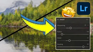
photos
may need much less sharpening, while others need a little more. But don't take these values as gospel, this is what you should do with each photo. I just want to show you how I use it.Now that we have the amount checked, you'll see that there are three additional sliders. There is radius, detail and masking. The way the radius works is that it controls the thickness of the edge where the contrast I was talking about was applied. So if you have a lower value, it will give you a thinner edge where the detail is added. And then if you add a larger value to the slider, you'll get a thicker border. and I'll show you what it looks like. Then with details, the details slider basically controls the amount of sharpening that is applied to the details in the photo.
So if you have a low value for that slider, it's basically just going to sharpen the larger edges. And if you have a higher value, it will sharpen even smaller edges, so it will give you a lot more detail. Again, hold down the option key, this is how I use it, and you'll see the image take on this kind of mask view. If I bring the radius slider to the left, you'll see here basically the thickness of the border where we're applying that contrast, it's very, very thin. So you hardly see that outline anymore. However, if we take the radius slider all the way to the right, you'll see it become much thicker.
I do not recommend this. Basically what I recommend doing is taking this radius slider until you get a rough outline. Here this is almost invisible, it seems very soft. But when we get it to that point, it looks good. We're starting to get nice, crisp edges, nice, defined edges. So I'll let it go and do the same with the details. If I bring the detail slider to the left while holding down the Option or Alt key, you'll see that details are only applied to the largest edges, only to the largest lines in the photo. But if I take it here to the right, every little edge of the photo has sharpening or detail applied to it.
And that can also result in over-sharpening. So what I recommend is similar to the radius slider, until you get a nice clean outline of the image, that's when you'll want to let it go. And if you click on the little eye icon here, you can see that it actually does a really good job. If I toggle, everything looks a little softer here, but with sharpening, it adds just the right amount of detail. Now there is one final slider that is very important and that is masking. Normally the masking will be set to zero and when working with masking I recommend zooming out to adjust and see the full image.
Masking controls where sharpening is applied and where it should be removed. Now, generally areas that are smooth, like the sky, don't have a lot of detail. Even things like the little waterfall here and this little body of water, they don't need any sharpening applied to them. So the way I use masking is to press and hold the Option key, just like the other three sliders, and I start dragging. And you can see here that we're getting a proper mask view. As I drag the slider to the right, more and more sharpening is removed from the photo.
How do you know where sharpening is applied? It's pretty simple. Anywhere that is black means sharpening is being removed and anywhere that is white or gray, sharpening has been applied. The way I use this masking slider is by adjusting it until it's almost like a pencil sketch of the image. Over here, this is a nice pencil sketch of the photo. Notice how the waterfall has been masked and how everything but the edges of the clouds in the sky have been masked. We don't want sharpening applied there. So when I let go, I can now be sure that I'm applying sharpening only where it needs to be applied, which is the edges of the photo area.
Look, I told you, just some of these modifier keys, they're really powerful. They can fundamentally change the way you interact when editing your
photos
using Lightroom. It just gives you a different and sometimes better way to visualize the changes you're making. Now, as I said at the beginning of this video, if you want to learn more about Lightroom and mobile photography, I invite you to subscribe to my free weekly newsletter. That link is in the description below. I also have this playlist here which has a ton of Lightroom video tutorials for desktop and mobile if you want to continue your learning journey.If you like this video, as always, a thumbs up is appreciated. Be sure to subscribe and click the bell icon to receive notifications of all future videos. Thank you very much to all.
If you have any copyright issue, please Contact